NASA Redesign
OVERVIEW
My team was tasked with redesigning a government website in 4 weeks. We chose the National Aeronautics and Space Administration (NASA) because we felt like it would be a good challenge as the website is full of information.
TEAM
1 researcher and 1 designer
DELIVERABLES
Research (Usability testing, Feature Prioritization, User Flow, User Persona, Qualitative and Quantitative Data)
Heuristics (Redlining, Annotations, UI Style Guide, Nav Components)
Wireframing & Prototyping
TOOLS
THE PROBLEM
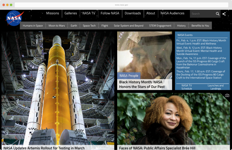
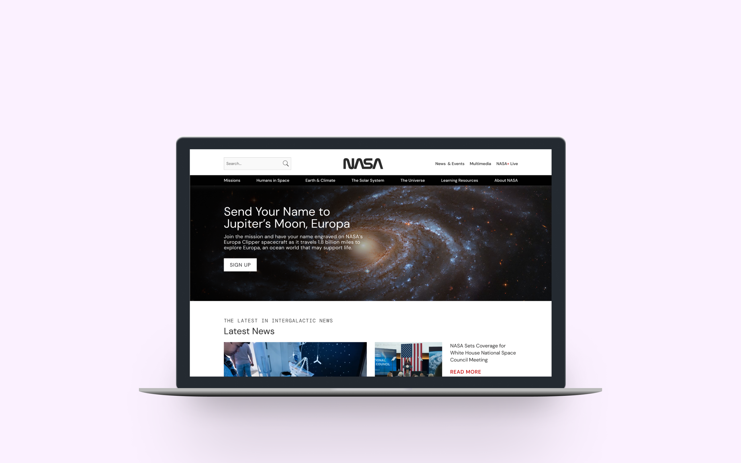
NASA’s webpage is poorly designed with lack of hierarchy on the homepage, color contrasting issues, unscannable wordy text, and cluttered navigation.
Old UI
THE SOLUTION
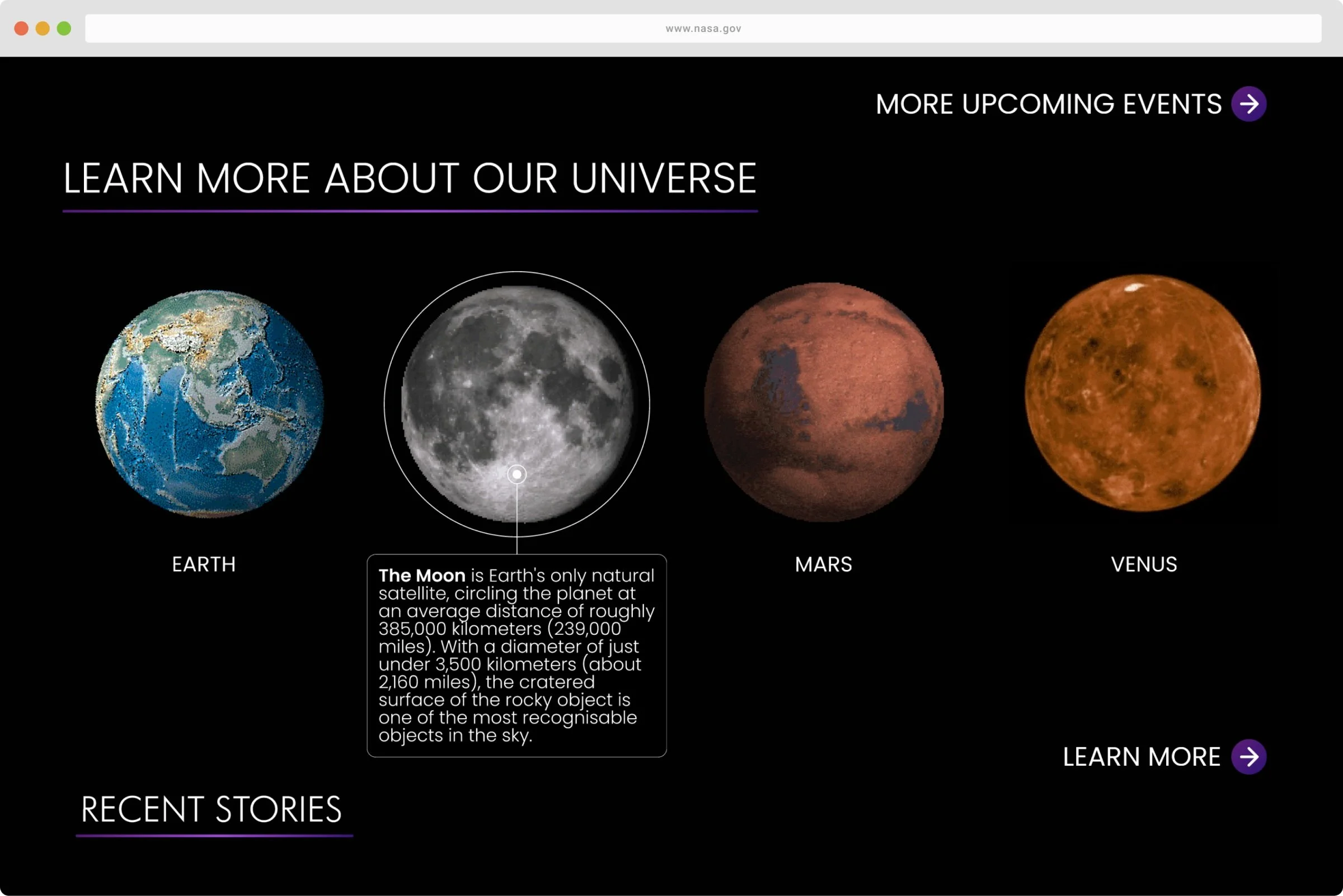
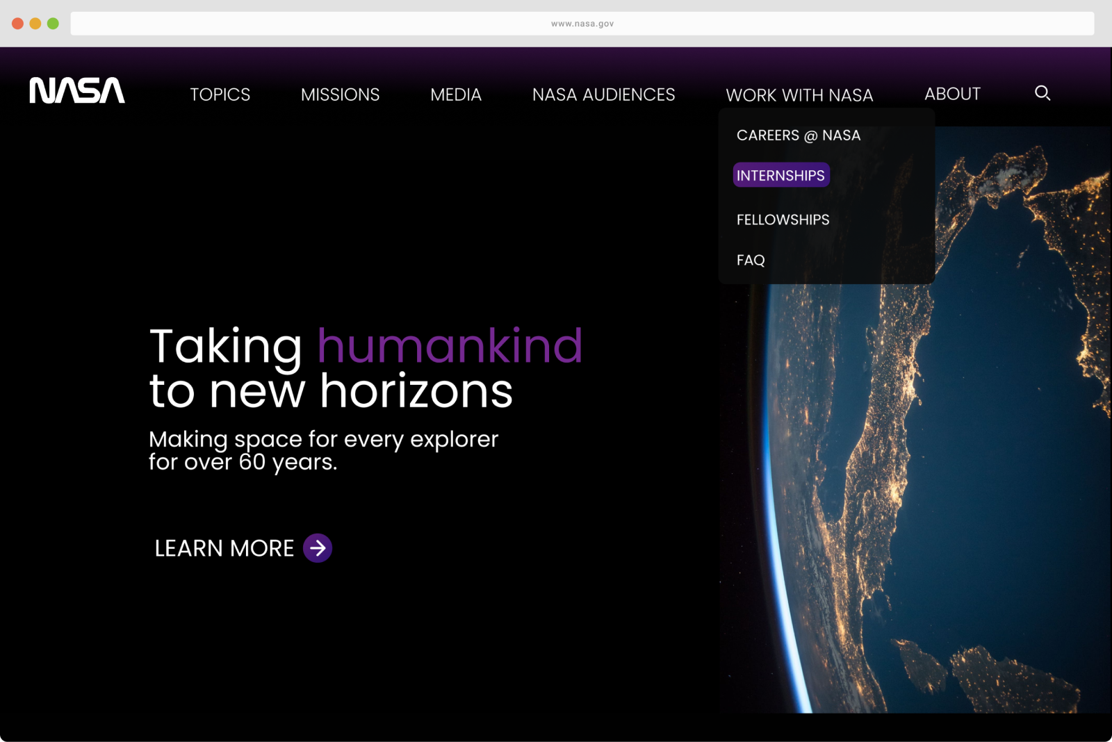
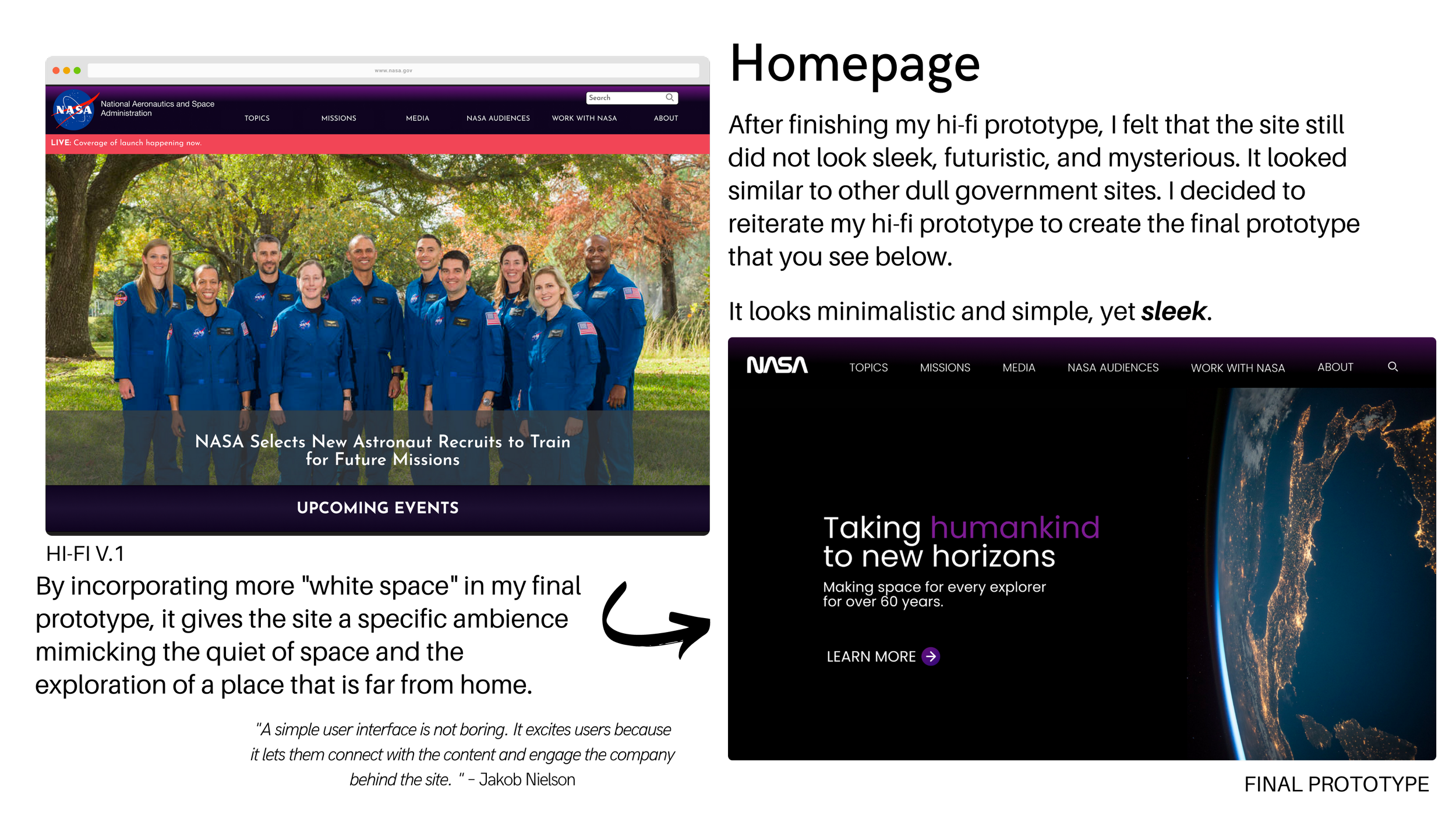
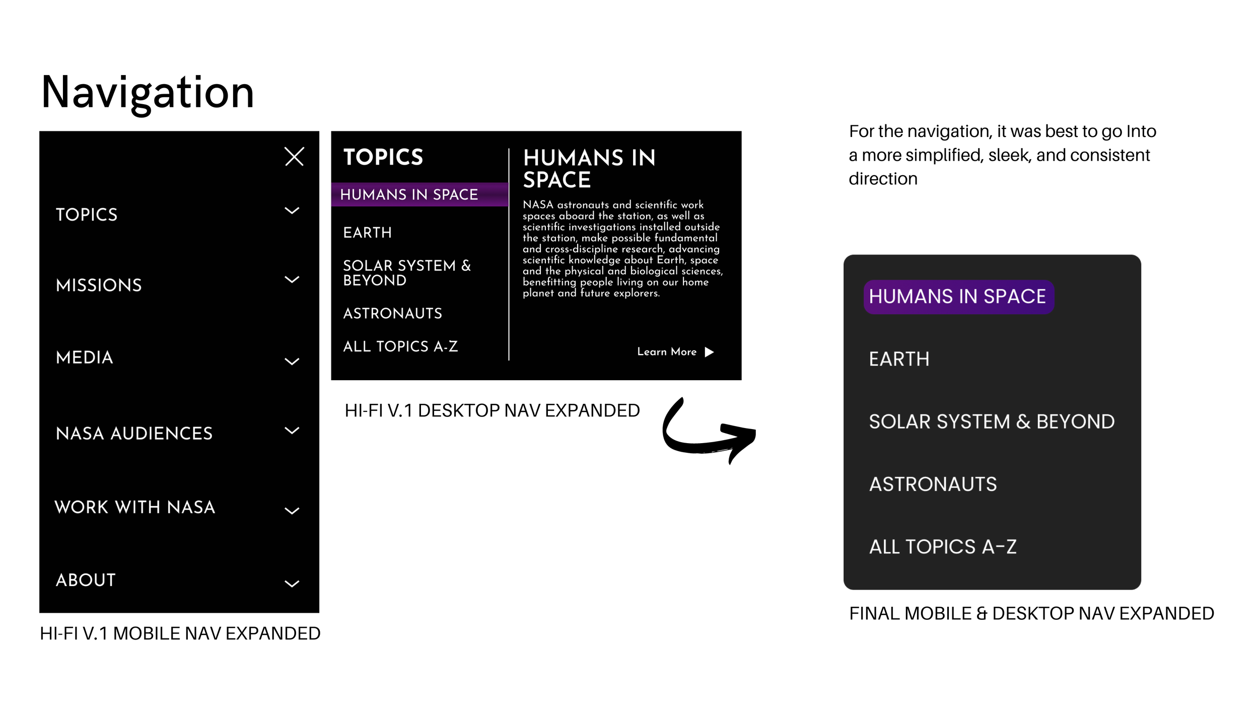
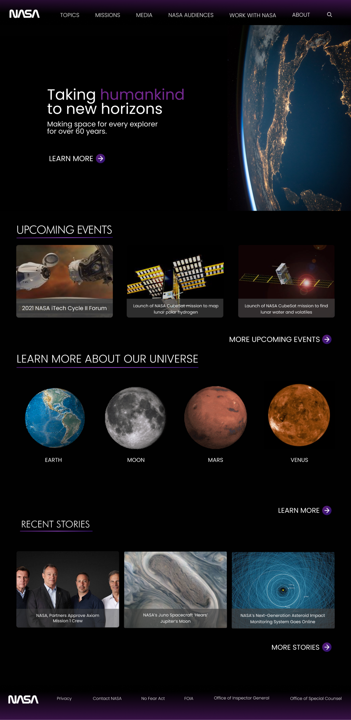
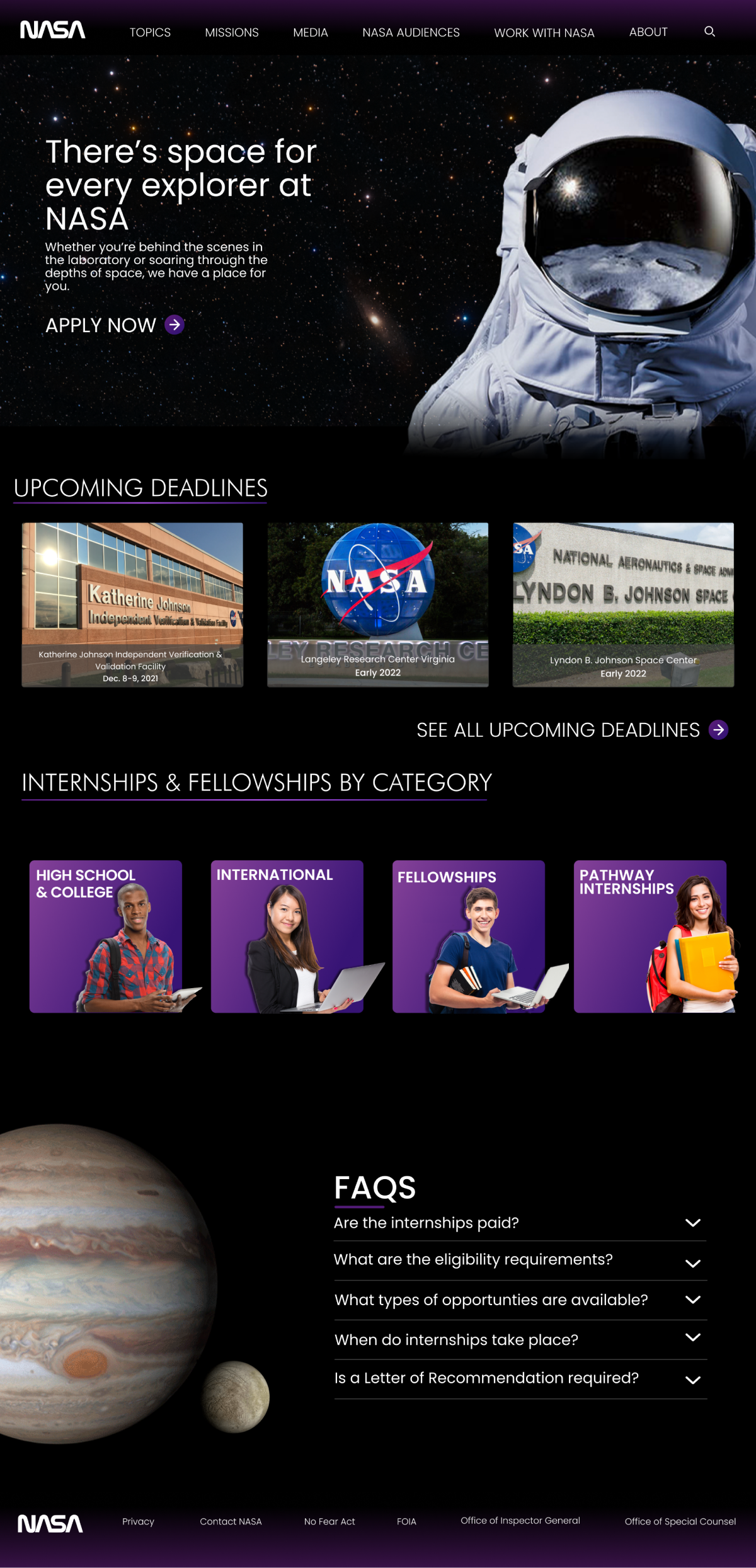
A simpler web page design that allows user to view information in a more digestible format by adding color, emphasis on important information, structure hierarchy, as well as making navigation easier to browse.
New UI
HERE’S HOW WE DID IT
1
Discovery
2
Definition
3
Ideation
4
Delivery
Over a 4 week period, my partner and I worked together to clearly analyze and define the usability, navigation, and content issues regarding the current NASA website.
Once this process was complete, we then worked separately to create our own redesigns of the site.
Usability tests were conducted on a group of 12 individuals to examine aspects, such as the ease of navigation and scannability of the NASA website.
-
"Finding the internship page was way more difficult than it has to be. I almost gave up."

-
"There’s so much content on the homepage. My eyes don’t know what to focus on."

-
"Site doesn’t feel smooth to navigate and looks like it hasn’t been updated in years."

had difficulty finding specific pages
83%
felt overwhelmed or confused by the amount of information on homepage
91%
had difficulty scanning text
41%
felt that there were too many navigation tabs
58%
commented on the color contrasting on the site
83%
relied on search bar to find specific pages
75%
The NASA homepage lacks content hierarchy. The content looks thrown onto the page and fails to show users the rank of importance in content.
Context chunking
Navigation
Colors did not contrast well on the sight and font/sizing was a hurdle on various pages.
Locating certain pages such as the internship page was difficult with the amount of content and information on the website.
Color & font sizing
USER PERSONA
Meet Vanessa Matthews
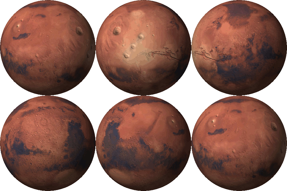
Vanessa is a student that is currently majoring in biochemistry. Her father works at NASA and because of this, she has always been fascinated with space since she was little and is currently seeking a potential internship opportunity with NASA. She is particularly interested in being apart of future missions to Mars.
Needs
Wants NASA website to be less cluttered, and have a cleaner interface
Wants a smoother and easier experience with NASA website
Wants a more colorful and interactive internship page
Pain Points
Navigating the pages gets confusing quickly
Text is often too small making it easy to miss important information
Feels that NASA website has way too many pages that are not organized in a clean way
USER FLOW
Vanessa visits the NASA website in order to get information about internships and fellowships geared towards college students and recent grads. She also frequently visits the site in her spare time to view NASA’s Image of the Day & to get updated information on the Mars missions.
STYLE GUIDE
Color Palette
System Icons
Imagery
According to Medium, purple is associated with wisdom, dignity, independence, creativity, mystery, and magic. I hoped that with including purple in my color scheme, it can incorporate all these themes within the NASA redesign.
FINAL DESIGNS
Home page
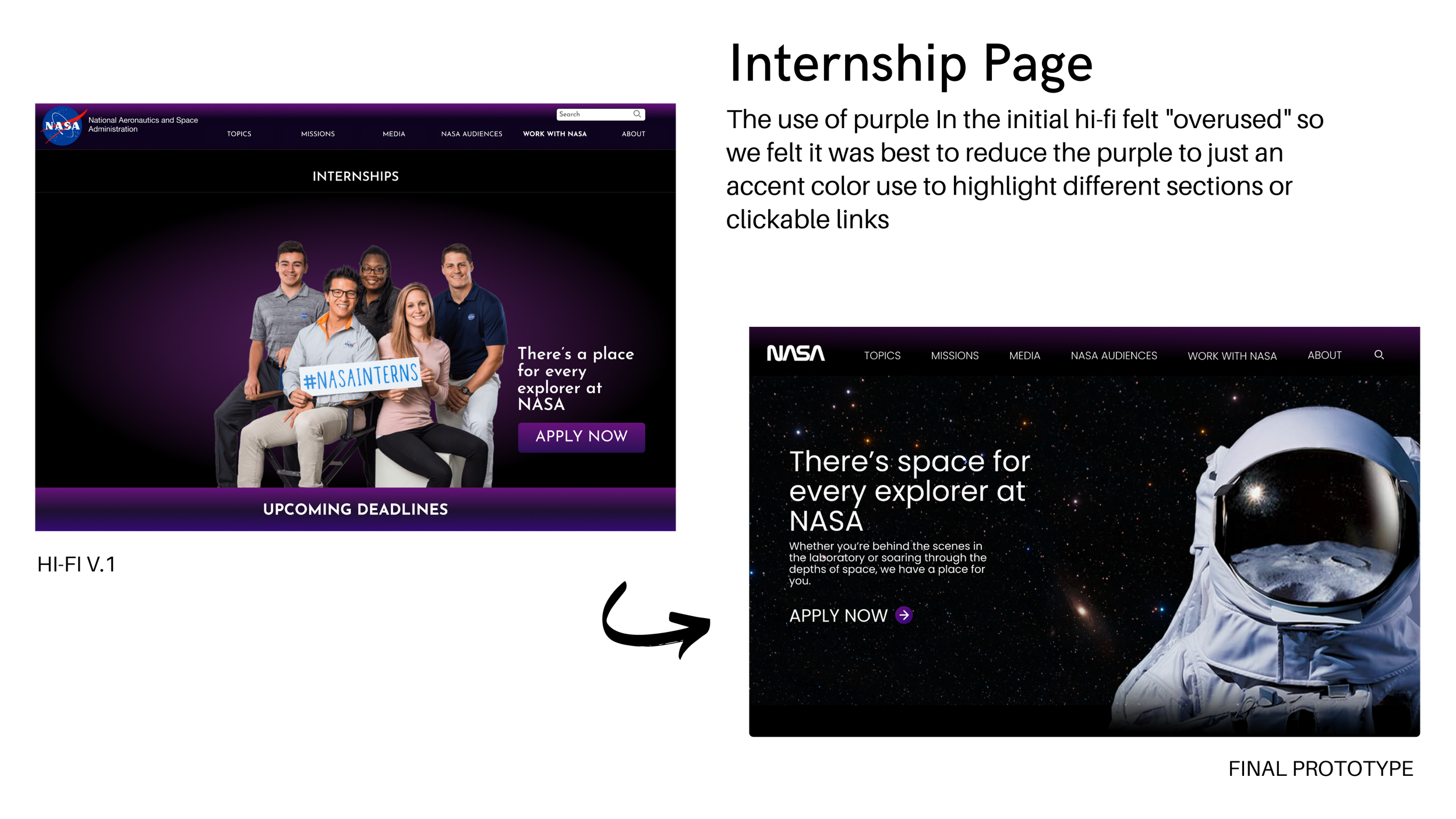
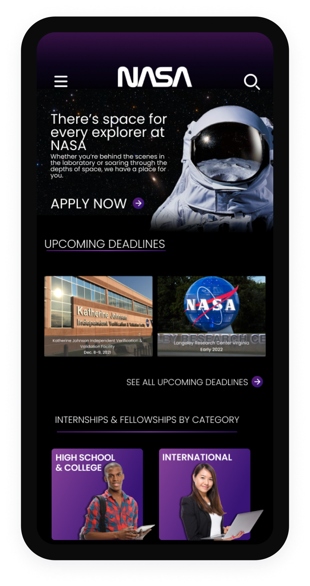
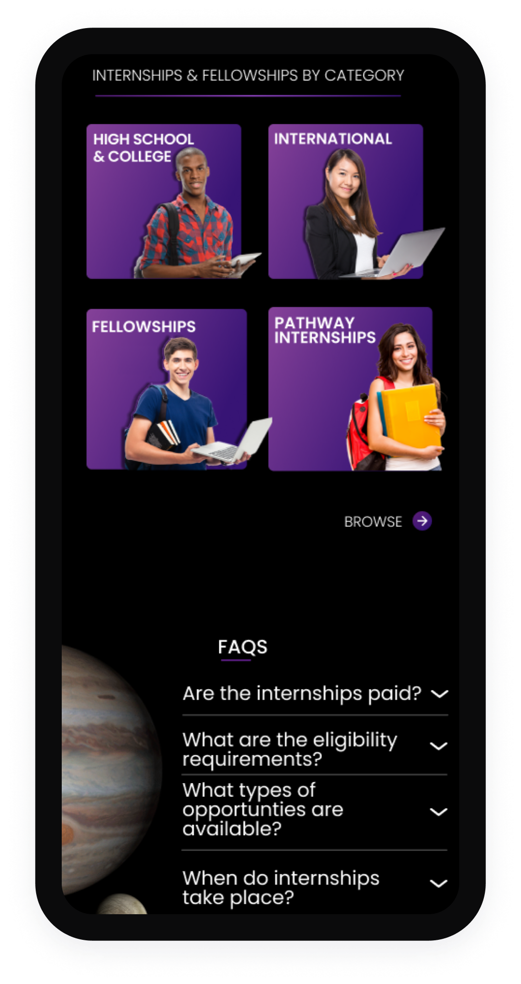
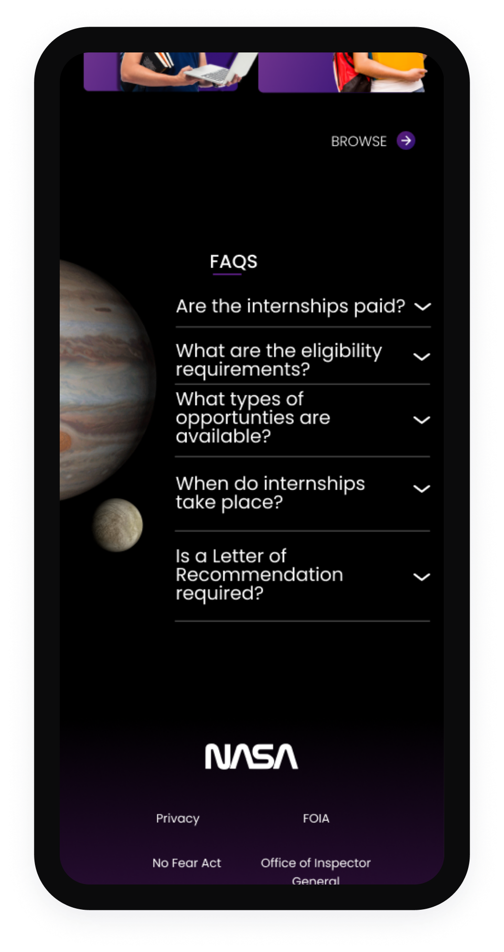
Internship Page


